Design & Development, IPPINKA BLOG
Money, Keys, Cards: The Idea That Stuck
03
May
May
In our last blog post, we were uncertain of our design details, still playing around with a variety of models and mechanisms. As we continued our journey to designing this latest product, we stumbled upon the idea that stuck.
The Idea
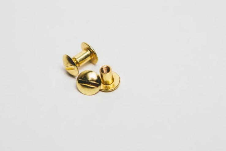
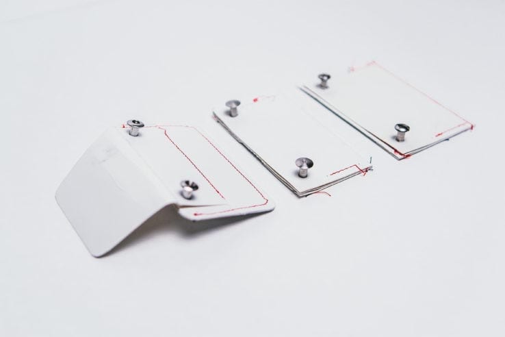
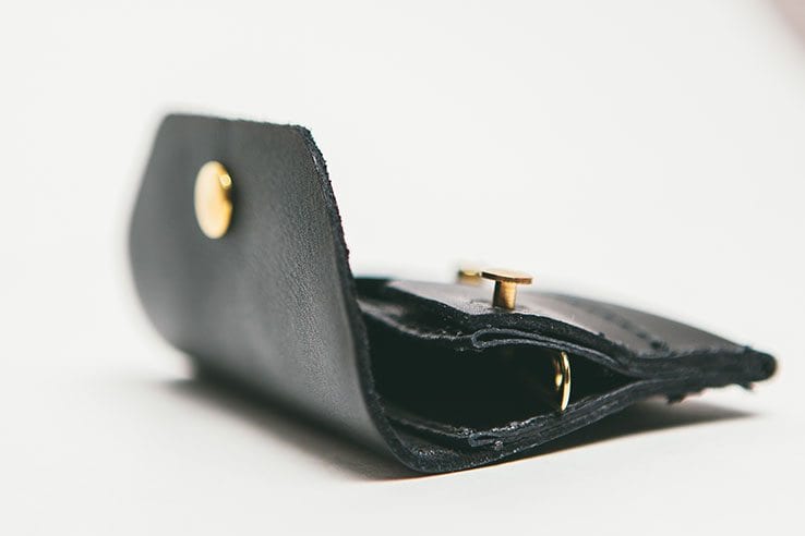
We decided to combine keys and a wallet component into one seamless product. After weeks around the drawing table, we came up with a concept that would use Chicago bolts. The Chicago bolts created a mechanism that would allow users to easily slip their keys in and out of the wallet, while still being one entity, or product. This eliminated the risk of users misplacing their keys. It was time to build our first prototype.
Beta Product
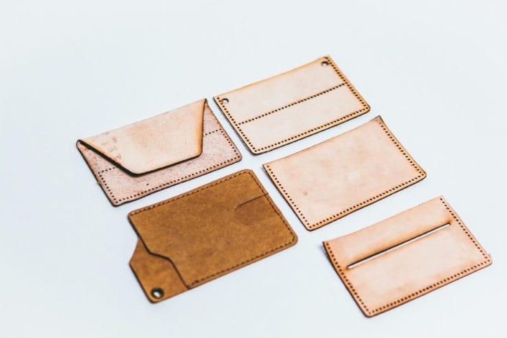
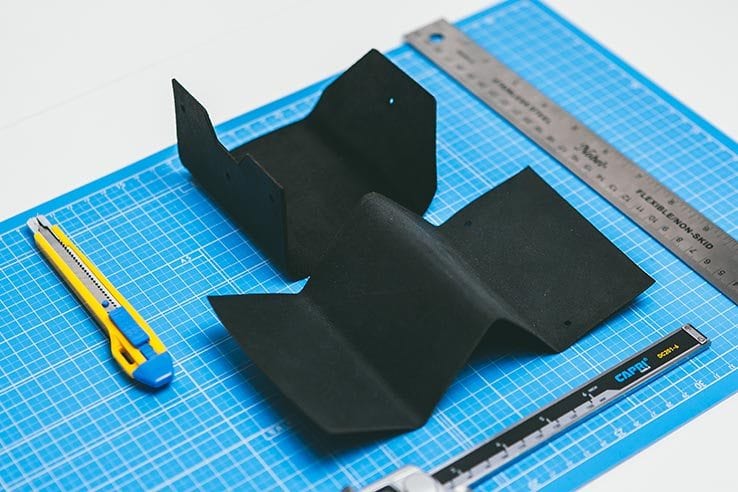
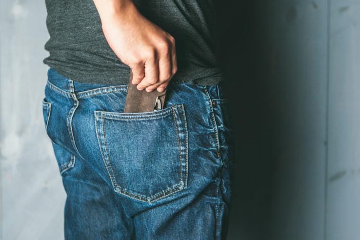
We began drawing each section, which would then be pieced together. With preliminary sketches completed, we created our first prototype out of cardboard. It was like finally completing a puzzle. Although the details were not perfect, we were starting to see our vision come to life. With each piece of the wallet outlined and measured, we could create a usable product. Pieces of leather were laser cut and stitched together. We finally got our hands on our first prototype. It was time to bring it to the streets of Toronto. Was it going to be well received, or too gimmicky?
User Testing
With our first usable prototype, we recruited friends who would come in with an unbiased eye. We wanted to get an outsider’s perspective on the features and practicality. More specifically, ensuring that the slim wallet was still able to sturdily hold their cards and money. There was also some talk about incorporating RFID protection into the wallet, but after further discussion, that feature did not seem to be a requirement for many. The feedback we received was mainly positive, with only a few questions raised about the aesthetics. The product had been integrated into the user’s everyday life, simplifying their lives and serving its purpose as both a wallet and a key chain.